Client
Agency
Job
DETLINES – THE DESIGN SYSTEM FOR ALL ZDF PRODUCTS
DetLines is the central design system for all ZDF products, ensuring that users enjoy a consistent user experience across all delivery platforms. The entire product landscape is always taken into account: web, mobile apps (iOS, Android), and big screen (TV-HTML, Android TV and TVOS). With DetLines, new features and applications can be implemented efficiently, consistently and across platforms, whilst providing the team with a unified understanding of tokens, components and patterns.
Goal
The design system is based on the Atomic Design approach, meaning that, in addition to the ZDF streaming portal, further products for ZDF can be developed efficiently at any time. A clear set of guidelines assists in the use of components and patterns across all delivery channels and platforms. This helps to avoid special cases, facilitates coordination, improves collaboration and speeds up QA processes. All components and patterns have been developed with a focus on accessibility, ensuring inclusive use. By taking into account user studies, personas and user journeys, DetLines helps ensure that new products are always developed from the users’ perspective.
Challenge
The large number of different platforms (web, mobile apps, big-screen broadcasts) and the requirements and expectations placed on a streaming portal called for a thorough understanding of systemisation and a deep knowledge of the technical challenges involved.
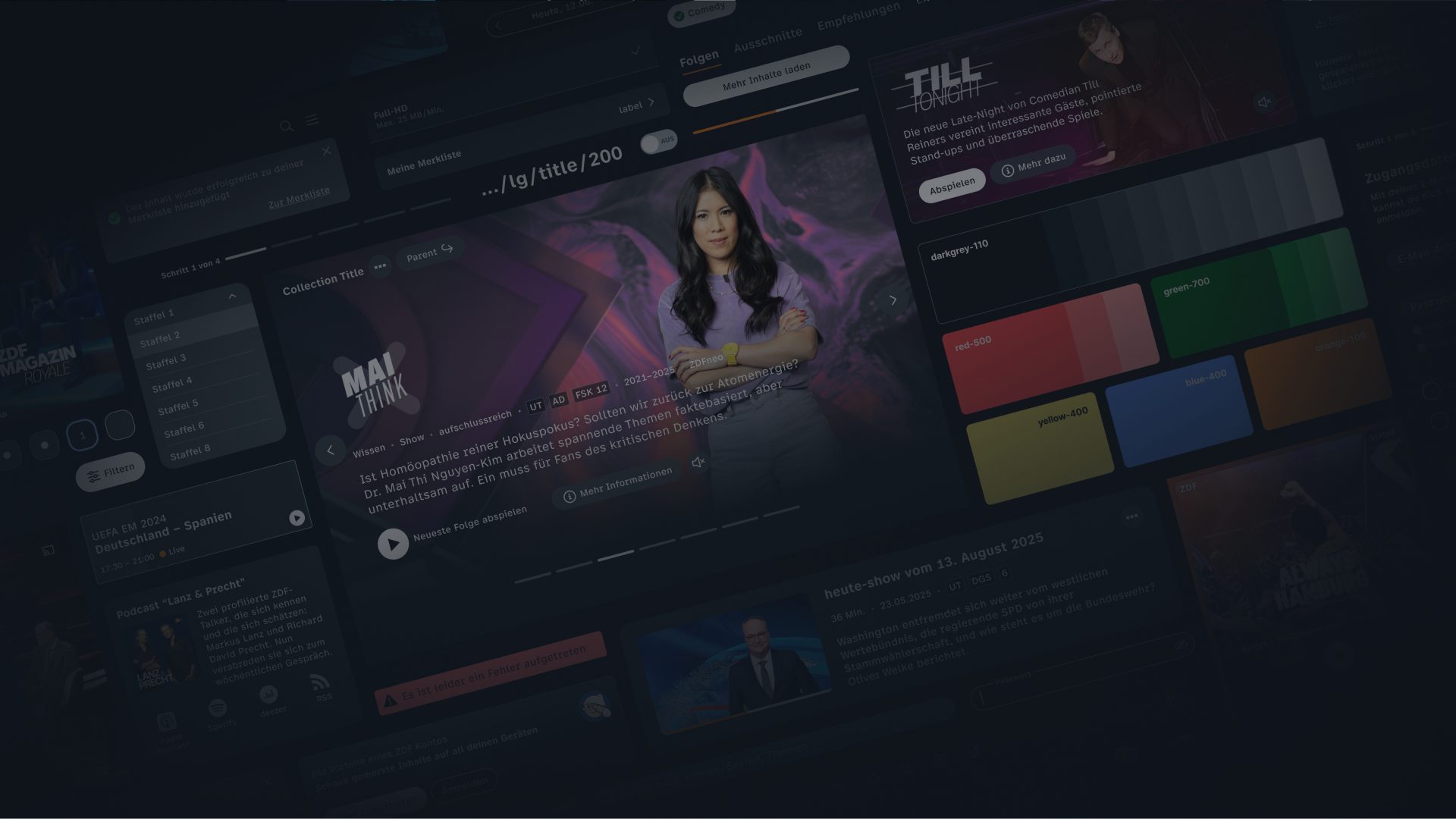
The new ZDF streaming portal is centred on users and their individual interests and preferences. Thanks to an improved navigation structure, users are now guided intuitively through the platform. Automated and algorithmically generated page types ensure that content is presented in a clear and organised manner.
The aim was to set entirely new standards for a modern, intuitive and inclusive streaming portal, and to provide a contemporary response to users’ growing demands through its public service personalisation strategy.
Strategically, the launch builds on key innovations from recent years: the “One ZDF for All” strategy has already significantly expanded the range of new content available for on-demand viewing. Furthermore, thanks to the collaboration within the ARD/ZDF streaming network, content from ARD and partner broadcasters can also be accessed via the ZDF streaming portal.
With in-house solutions such as its proprietary recommendation system, ZDF can also draw on extensive experience in automation and personalisation.
Due to these requirements for the new ZDF streaming portal, the old components and patterns had to be completely redesigned and, for the most part, redeveloped from scratch.
Design
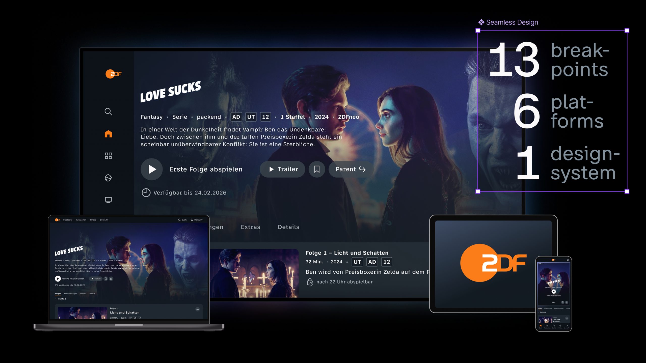
Thanks to this systematisation and a newly established single source of truth, all ZDF products can now be developed and implemented in a consistent, responsive manner, with uniform accessibility.
All components and patterns are now stored only once in Figma and in the frontend, and are referenced elsewhere. Through the constant comparison with the set design principles a uniform design and image language as well as user experience can be guaranteed across all platforms. This approach helps to speed up decision-making processes regarding new components and patterns.
Clear, innovative, visually stunning.
The new UI design stands out for its clarity, feels instantly fresh and is visually striking. Dynamic inspiration is the driving force behind the UI design and conveys the idea of personalised, endlessly engaging content on a visual level.
Simple, clear, catchy.
In all decisions regarding the new UI, ease of use, clarity and intuitiveness are the key factors driving our decision-making. Our aim is for users to find their way around quickly and always discover content that suits them and appeals to them. In doing so, we want to inspire them in the moment and create a ‘wow’ effect.
Primary focus on dark mode
Taking into account the ‘lean-back’ approach and the most common usage scenarios, we see the primary focus as being on dark mode.
A consistent user experience across all platforms and products
Our UI relies on cross-platform and cross-product components. We aim to deliver a consistent UX across all our platforms (where technically feasible) and products, without appearing overly uniform. Naturally, we take into account the specific operational requirements of individual touchpoints.
DESIGN
Principles
01
We design for people.
02
We confidently show our competences.
03
We create an environment that presents the content in the best possible way.
04
We reflect the proximity to the user in the design.
05
We learn from user feedback and work with empathy on further development.
Design approach
target audience
DetLines is aimed at all product owners, UX and UI designers, front-end developers and the QA team. Our focus on this target audience has been a key factor in shaping the structure and architecture of DetLines.
architecture
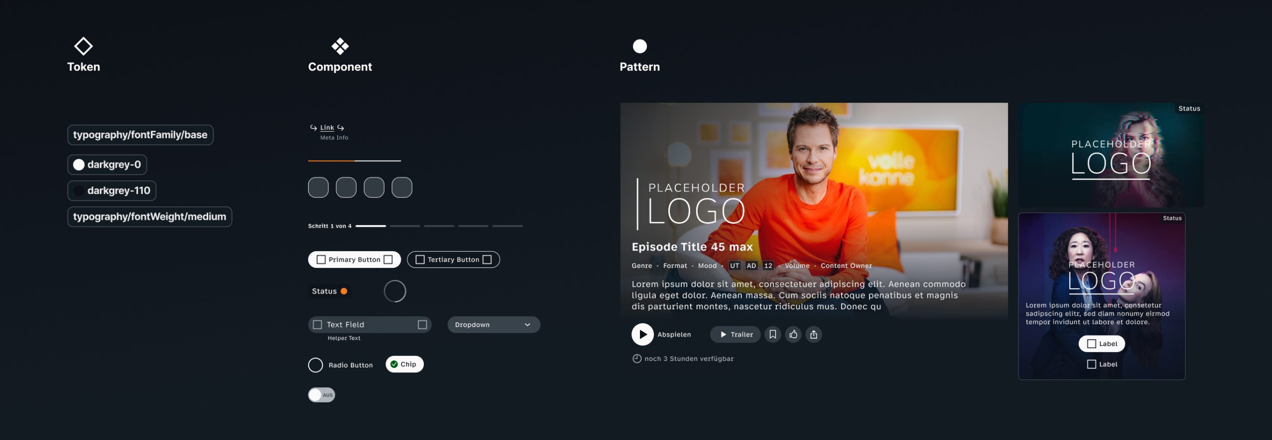
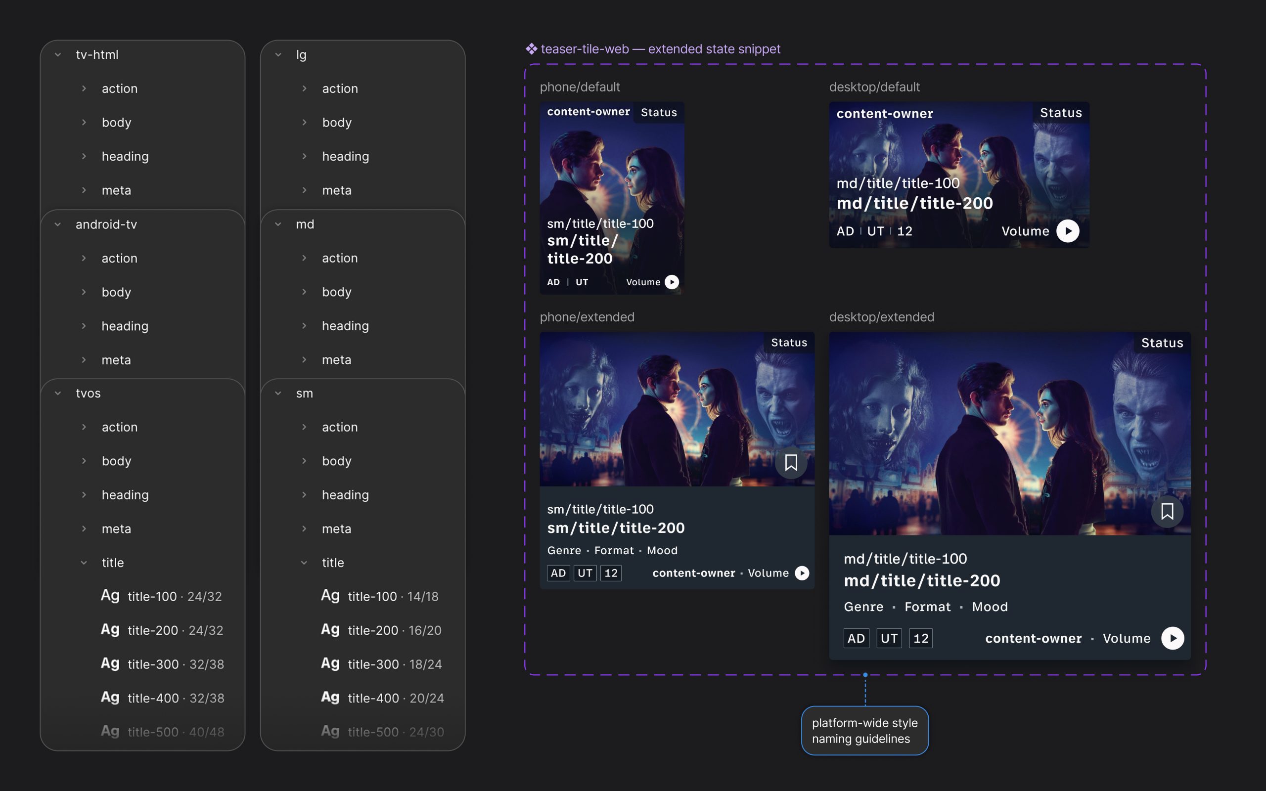
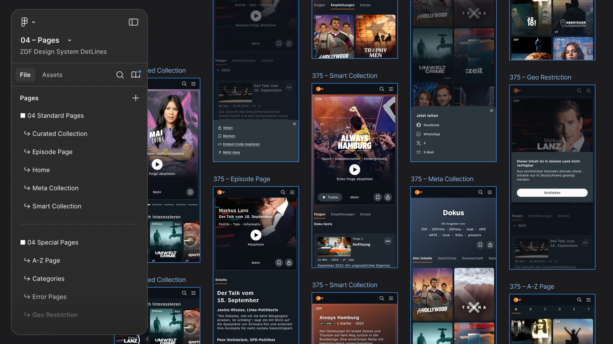
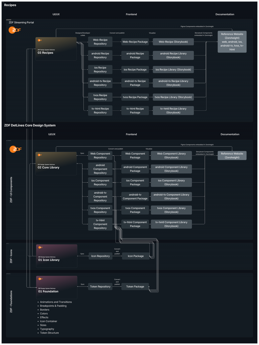
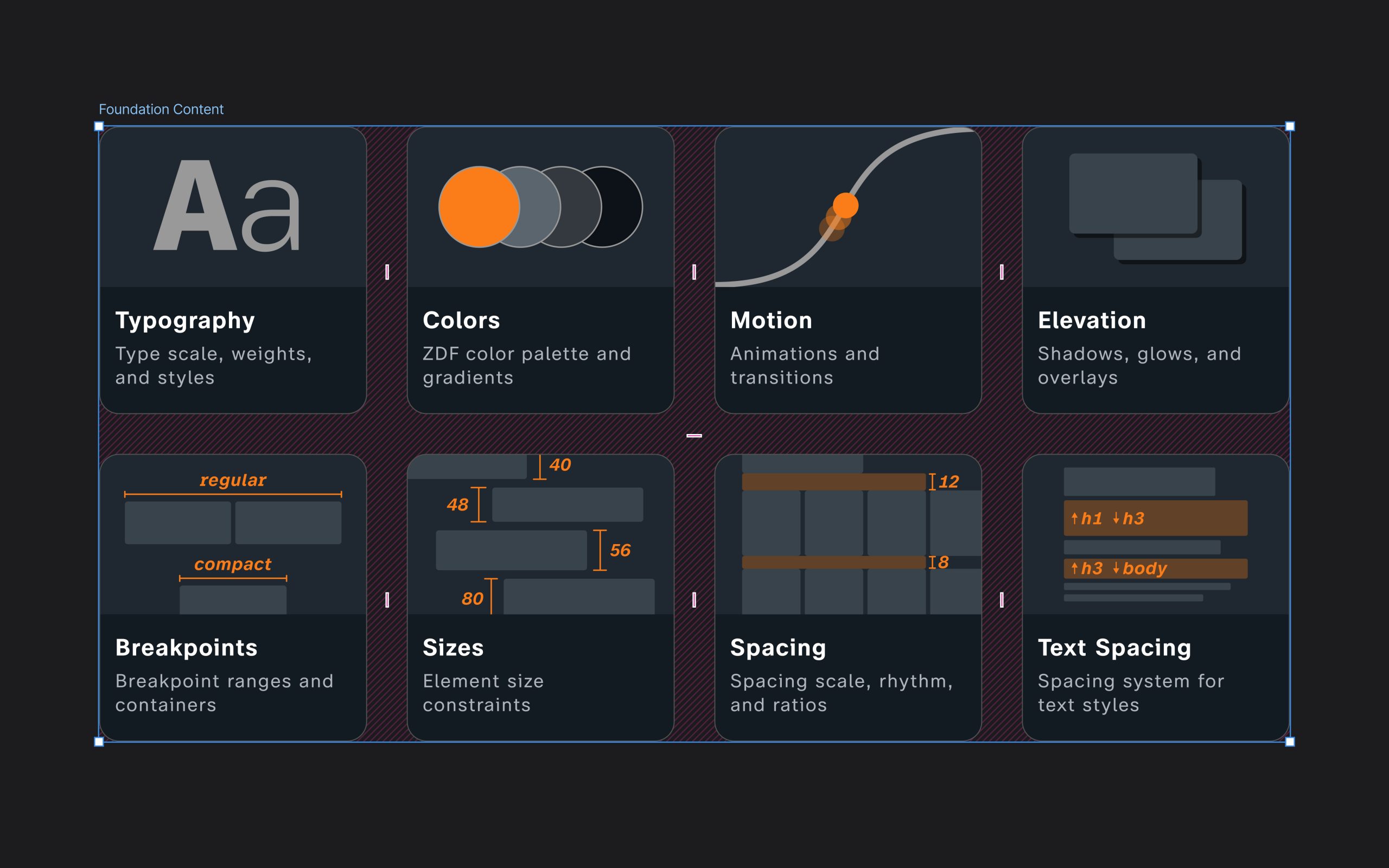
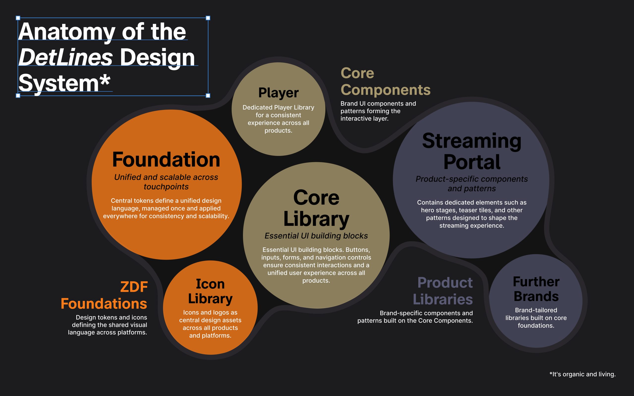
In parallel with the UI development of the new ZDF streaming portal and the associated concept, the DetLines design system was completely overhauled. Our team spent over two years developing the current version of DetLines. This design system consists of a Foundation Library, an Icon Library, a Core Library and the respective Product Libraries in Figma, the accompanying documentation in Zeroheight, and the front-end libraries and documentation in Storybook for the front-end.
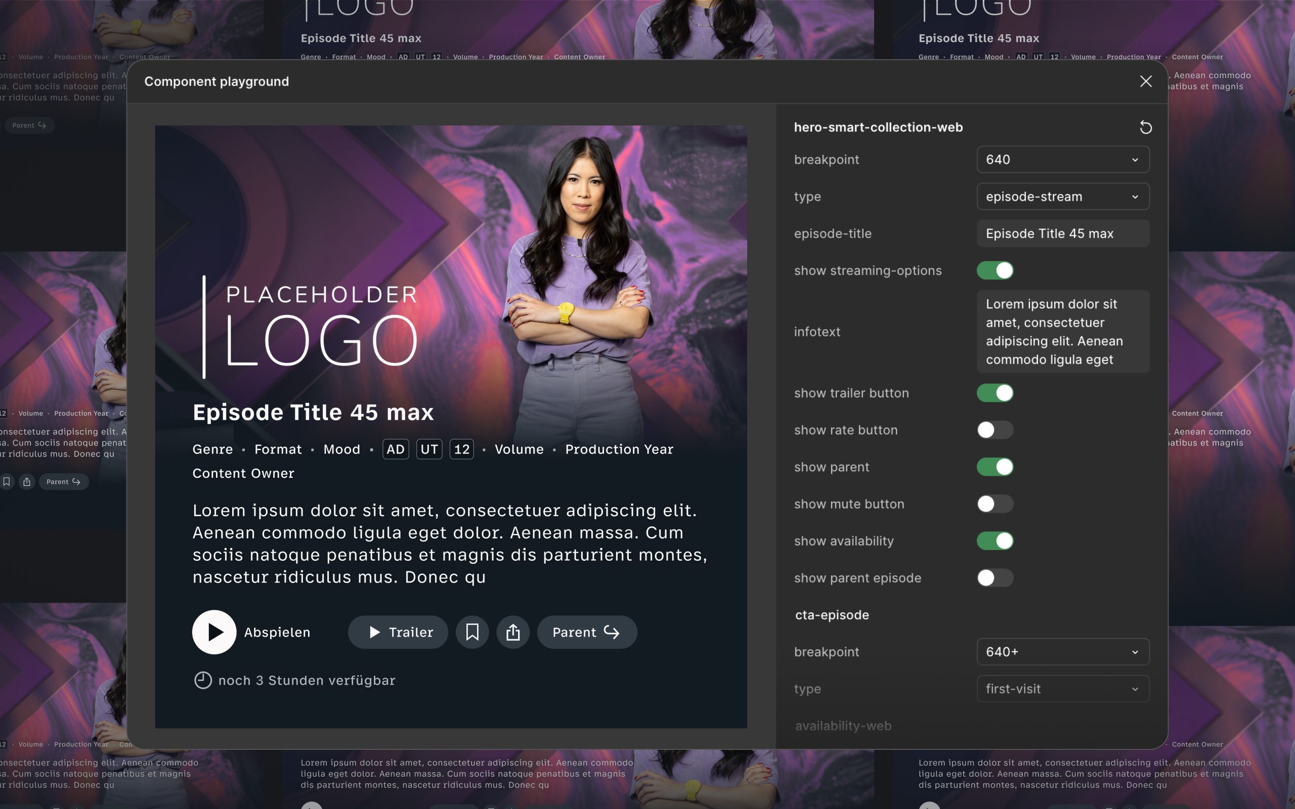
In this context, Zeroheight acts as the central interface between UI/UX design and front-end development, as it provides a direct link to Figma libraries and can integrate Storybook. The library demonstrates the behaviour, characteristics and, using live/mock data, an accurate representation of the respective components and patterns. With the new DetLines Core Library, new products for ZDF – alongside the new ZDF streaming portal – can be designed and further developed efficiently and purposefully. With the product library for the ZDF streaming portal, the product itself gains a recipe library that contains all product-specific components and patterns, whilst referencing ZDF’s core components and core patterns.
A common language
Across all departments and disciplines (PO, UI, UX, Dev, QA, etc.), we were able to agree on a consistent terminology for tokens, components, patterns, types and states. This has improved coordination and communication and helped prevent misunderstandings.
functional patterns
The current shift towards a ZDF streaming portal has led to fundamental changes in functional patterns. These have been incorporated into the new DetLines and form the core of the user experience.
Visual patterns
The new design language and the styles developed were intended to meet the objectives and requirements set for a modern streaming portal.
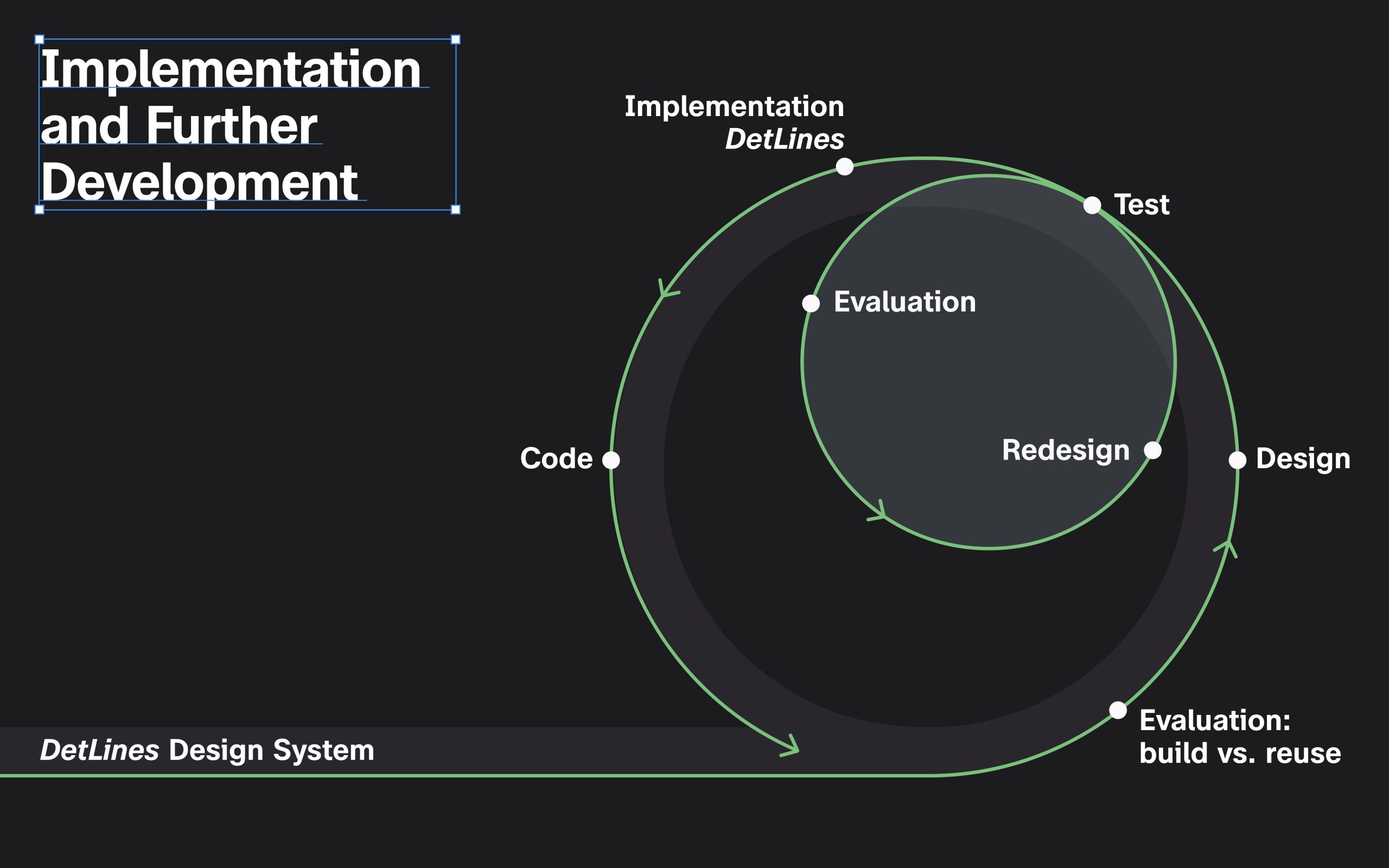
Processes for further development
At the same time, we have been working on processes to structure the collaboration between the product teams and the Design System team. How are new components introduced? Who decides on components? How do they reach all stakeholders, and how can we ensure that all products are designed using the core components? The aim is to ensure that components and patterns are not developed twice. As the Design System team, we actively support the product teams in their work, implement requirements quickly and efficiently, provide onboarding, and offer assistance and guidelines for implementation and use, so that DetLines remains an integral part of ZDF.
Accessibility
During the entire process, all patterns were constantly checked from the point of view of accessibility. The results of BITV tests enabled targeted improvements to be made and inclusive use and participation to be ensured. New components and patterns must always comply with the BITV 2.0 accessibility requirements. DetLines has accelerated these processes in all trades and allows us to react more effectively and efficiently to changes in user needs.
With the help of extensive additional programme data, content becomes more accessible, better categorised and clearly structured. Technical advancements, combined with a contemporary design and user-friendly content presentation, create an intuitive user experience for all target groups.
Team
The ZDF DetLines Design System was developed using an interdisciplinary approach:
product owner
Product owners have provided feedback from the user’s perspective, managed the team, coordinated between product teams and overseen new developments.
DESIGN
A team of UI/UX designers created a Foundation Library, an Icon Library and a Core Library for all of ZDF’s digital products, as well as a Product Library for the new ZDF streaming portal, in Figma. For each component and pattern, all six display options—including types and states—are immediately accessible, making them intuitive and quick to use for users.
Development
The front-end teams for each platform created their own libraries for the core components and the product-specific components and patterns – with a focus on reusability, testability and documentation for the front-end team.
architecture
A Design System Architect defined the overall structure and architecture of the components and patterns for the Core Library, Recipe Library and the interaction between the various libraries in Figma.
Documentation
A team documented tokens, components and patterns in Zeroheight, set up the integration with Figma and incorporated Storybook.
governance
A dedicated design system team is responsible for maintaining, quality-assuring and expanding the system.