
Client
Agency
(Former EXOZET)
Job
Link
Website for Berlin Brandenburg Willy Brandt Airport

Task
Together with the digital team of the corporate communications department of Flughafen Berlin Brandenburg GmbH, the task was to develop two new platforms for BER Airport – one platform for all travellers and one platform for all corporate topics. The concept and design were to be modular enough to form a design system and thus enable further products to be designed for the airport company in the future.
Challenge
Despite the passenger guidance system and all the service points, customers still experience a lack of orientation and misunderstandings about the services and processes. This poses ever new challenges for the airport staff, as many people with a wide variety of experience levels of all ages encounter a complex system. A system with a wide variety of stations and processes – from check-in options to checking in bulky baggage, searching for parking spaces, security checks, gates, boarding, baggage check-in and check-out, customs checks and much more. “Where do I go now?”, “Where do I drop off the bulky luggage?”, “How do I get to my gate?”. These and endless other questions lead to many uncertainties, challenges in passenger control and, of course, a high volume of traffic at the information desks. Especially at busy times, the passenger volume must be supported by the best possible balanced guidance system both at the airport itself and in digital form at all times to support the processes at the airport. Passengers should be able to view up-to-date, consistent data and information on flight status at all times and receive immediate assistance in the event of problems.

Partners and investors should be able to find the information they need quickly and intuitively. Journalists need reliable sources and materials for their research and want to be able to compile them quickly and easily. Neighbours and residents want to be informed about aircraft movements and current events and get in touch with contact persons. In addition, the career section was to present the company as a close employer and present the diverse jobs and development opportunities within the airport company.
PREVIOUS WEBSITE
This was both structurally and conceptually outdated and in need of UX and UI improvement due to too much nesting of content and wasted space through repetition of menu levels. Users often could not find the information they needed. One reason for this was that there was only one platform for all target groups from the traveller and corporate sectors. The user interface of the flight search function was also outdated and no longer sufficiently geared to the requirements of today’s user habits.
TWO WEBSITES
Due to the completely different target groups with different needs, we agreed early on to divide the site into two platforms: One website for all travellers to, from and about BER and one website for all corporate topics (real estate, partners, airlines, processes, careers and much more).
THE MISSION
FOR TRAVELLERS
It was already clear to us in the strategy phase that we did not want to simply be an information provider with the new platform for travellers. The new platform should be more than a mere retrieval point of generic information. We wanted to create real added value, i.e. services that help international users to concentrate fully on their journey and that respond to their needs. By always providing up-to-date information, travellers should be directly given a sense of security so that they can be relaxed on their journeys via, from and to BER. The core question and mission for our target group “travellers” was therefore:
How can we develop a digital guide that offers travellers and those around them (e.g. drop off) the best possible orientation in order to travel in a relaxed manner?
The connection between the airport building, the place where the users are and their digital device was important to us. Pictograms, the passenger guidance system, the arrangement and the type of orientation should also be reflected in the digital space. The characteristics of the airport should be digitally reflected and clearly recognisable.

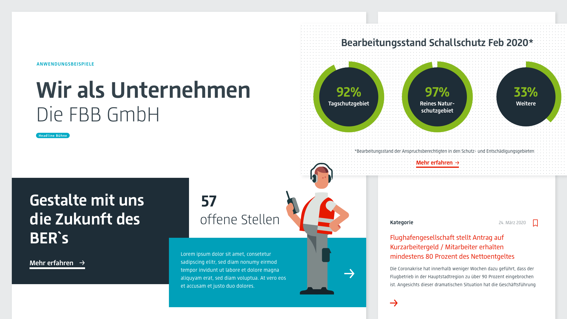
FOR CORPORATE
Since partners, investors, neighbours, the press and job seekers need completely different information and services to facilitate their work, we consider these target groups separately. They are looking for well-prepared data and information and often have little time for this. The core question or mission for these target groups was therefore:
How do we manage to provide a digital platform so that interested parties can access relevant information and data/documents from FBB GmbH in an easily accessible and memorable way?
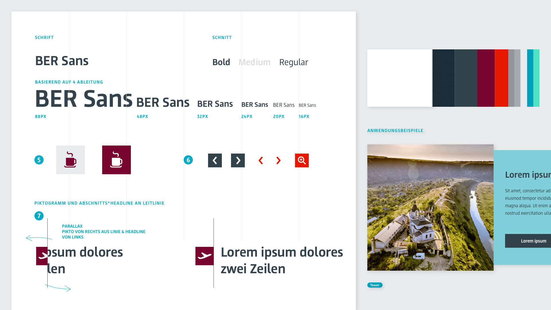
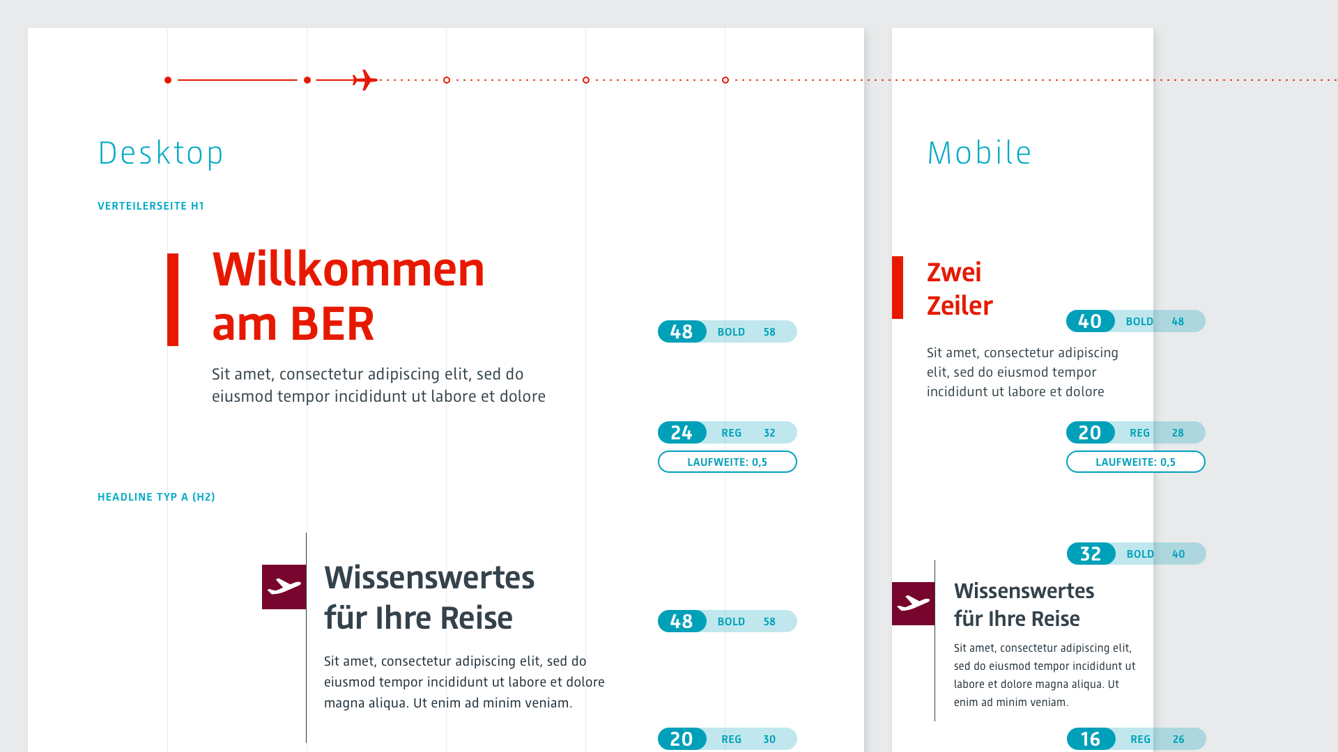
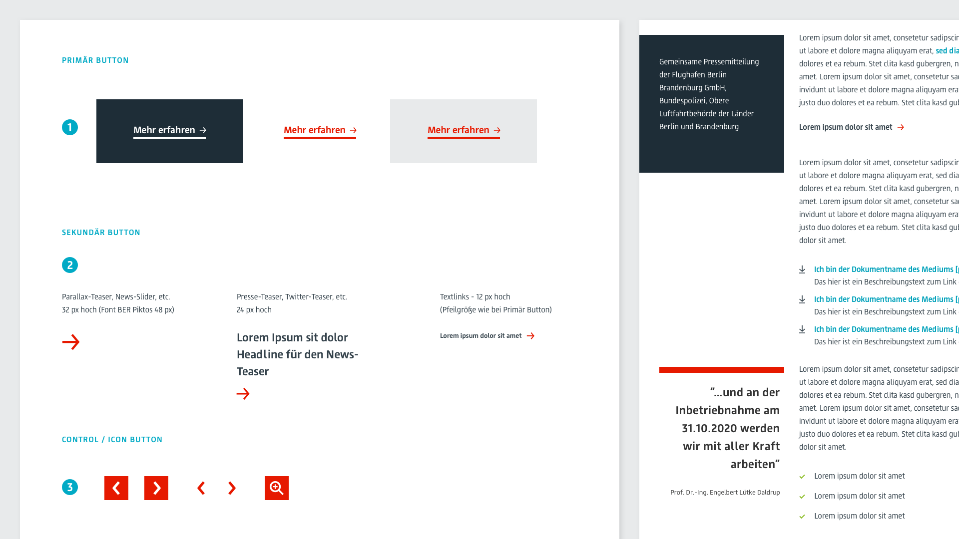
GOALS FOR THE DEVELOPMENT - DESIGN SYSTEM
Starting from the platform as the maximum expression of all possibilities, both in terms of components and technical conditions, the system should be designed in such a modular way that further pages and products can be designed and developed with it at any time. As a result, all trades were required to recognise synergies and react very flexibly to changes, while always adhering to fundamental principles and functional patterns. The biggest challenge here was flexibility, as external and technical circumstances can change quickly. Without many iteration stages in the implementation, the concept and design should be directly realisable.
APPROACH
THE RESEARCH-PHASE
Using web analytics and an extensive analysis of the largest airports and airline websites worldwide, we were able to carry out detailed elaborations of proto-personas and user journeys at an early stage, including the regular passenger surveys at Tegel and Schönefeld airports. The completely different needs of the users became clear – from barrier-free travel, travel with children, transfer travel to purely business or tourist travel. In the research phase, we applied the following methods and took additional measures:
- Interviews with the areas of Corporate Communications, Terminal Management, Commercial, IT Applications, Aviation Marketing, Systems & Processes, Human Resources & Organisation, Surroundings & Diversity, Noise Control & Environment, Strategic Real Estate Management, Portfolio Management / Leasing / Own Use helped us to get to know the various areas and to identify their needs and requirements for the new platform.
- A complete content audit of the previously existing website served us to capture and restructure the scope and all information.
- On-site tour of BER Airport with detailed training on the special features of the airport itself (architecture, guidance systems, pictograms, inclusion of the surrounding area and much more).
- Participation in the ORAT (Operational Readiness and Airport Transfer) test operation of the BER… In the process, air travel had to be simulated through concrete passenger briefings. Subsequent feedback helped BER to structure passenger processes even better.
- A guided tour of the Tegel Airport premises helped us to grasp the airport processes, e.g. the responsibility of the airport, airlines as well as other partners meets the needs of the traveller. In addition to the usual processes, which can be overlooked by normal travellers, we got to know further, specialised processes.
- Card sorting helped us to tailor the naming and clustering of menu levels and information even more precisely to the target groups.
- Based on the regular passenger surveys and interviews, we were able to map different proto-personas and their challenges. From this, we have formulated the values and goals of the users and made these the focus of the product development.
- To better understand the needs and problems of the different passengers, we have created detailed user journeys. These exemplified the challenges for the respective target groups and helped us to describe the requirements for the new website.

UX AND DESIGN PROCESS
We started with rough initial sketches, through mid-fidelity wireframes to concrete wireframes of the functional patterns and design patterns of the components, atoms, form elements and page templates. The research phase showed that over 65% of users accessed the original platform via mobile. This percentage is expected to increase in the future. This made it clear that mobile access was the focus of the development. In addition, UX tests were conducted with previously elaborated target groups. The evaluation of these tests helped us to better understand the needs of the users and to take them into account in the services.
Design principles
It was particularly important to us that international users understand the information equally, be it the pictograms, the design language, the navigation – everything should be able to be grasped quickly, especially on mobile devices. To ensure that our UI and UX adaptations and innovations actually meet the needs, we have based the development process on the following design principles for the traveller platform:
01
Simplicity
02
Identity with the place
03
Unity in diversity
04
Structural order
We have based the corporate platform on the following design principles:
01
A look ahead
02
Structured
03
Reliable partner at eye level
04
Solution-oriented
We have developed a consistent design language and styling for both platforms to provide the same experience for international users, but also to increase efficiency in development.
Tonality principles
Our tonality principles for the traveller platform are:
01
Simple and minimalist
02
Characteristic
02
Relaxed & Calmed
Our tonality principles for the corporate platform are:
01
Clear
02
Authentic
03
Connective
04
Motivating

SERVICES
THE FLIGHT SEARCH
The flight search was one of the biggest challenges due to its complexity. In principle, airports are highly dependent on the data provided by process partners. First of all, the data had to be divided into those that are definitely available and those that can only be displayed with additional delivery by partners (in expansion stages). Based on this, the website was designed to handle the different amounts of data without any problems. After this classification, it was also clear that the data was available for at least the past three days, the current day and for the next three days. The research results allowed a direct prioritisation of the data and had also revealed that the airport page is most frequently accessed to retrieve flights taking off and landing at the airport in the near future. Accordingly, we have already taken the findings into account on the homepage: Users can now quickly and intuitively switch between approach and arrival and enter destination/arrival city, flight number or airline and, depending on the entry, the best hits are displayed directly as typeahead in order to go directly to the respective flight detail page and not be sent via the flight list.

Flight list
The flight list shows an overview of all departures or/and arrivals for a selected day. The unfiltered view is similar to the view of the flight board at the airport on site. In addition, various filter and search functions are available. Users can change the time period, select the terminal and thus further narrow down the data displayed. The list itself displays the most important data and the current status of the flight. Users can click on a flight to go directly to the flight details page.
Flight detail page
On the flight details page, users can find all the relevant data for their selected flight. With the clearly visible flight number, users can immediately check whether it is the flight they are looking for. The codeshares (other flight numbers under which this flight takes place) can be called up below. On the flight details page, the flight can be remembered quickly and easily via a toggle (described in more detail later). The illustration of a plane between the departure and destination airports, including the corresponding IATA codes, makes it immediately clear whether it is a departure from BER or an arrival at BER and what the current status of the flight is.

Departure from BER
Information on the date, time, terminal, boarding time, flight duration, check-in, gates and a map are directly visible when calling up the flight details page for an outgoing flight. For an outbound flight, waiting times at security checkpoints are integrated (described in more detail later).
Arrival at BER
When arriving at BER, data such as information on the terminal, baggage carousel, gate and exit are directly visible.

All the necessary information on the operating airline is immediately displayed for the displayed flight. Accordingly, information on check-in facilities, baggage information and lounges, but also contact with the airline is available. In future, travellers who are picked up can immediately share the data with others so that relatives, friends or business partners are also up to date and can pick them up on time, for example. In future, tailored services will be located in the lower part of the page. In the conception, special care was taken to ensure that only those shops, restaurants & cafés are displayed that are accessible to the users due to the security areas. These expansion stages have already been designed and are currently being implemented and will soon be integrated. Thus, the flight details page provides the central point of contact during and before the flight and also links to all other necessary pages and information that should be accessible during the flight.
Bookmark flight
We have designed the “flight remembering” function so that passengers as well as people picking up passengers and other visitors can always stay up to date with the latest status reports on one or more flights. Users can remember the flights that are relevant to them at any time and have them pinned globally on the website under the top navigation. These flights are thus always in view and can be called up quickly. Changes to the flight status of these flights are always displayed in the visible area. Once activated, the memorised flight detail page and corresponding status messages can be called up at any time. If desired, users are not only informed about changes while using the web application, but also have the option of being informed about changes, such as gate changes, delays and much more, via various channels and can thus react to changes at an early stage.

Flight status and its effect
We have been able to identify several flight statuses that have a direct impact on the notices and data on the website:
- On schedule
- Changes at gate, check-in, baggage carousel or exit
- Delays with and without time
- Process steps such as check-in/end check-in/last call/end entry/started
- Cancelled
For arriving flights, the following additional or deviating statuses exist:
- Departed at point of departure (no expected time of arrival)
- Expected arrival (too early)
- Process steps such as approach/landing/exit/end of exit
- Redirected
- Cancelled
- No data available yet for check-in/gate/baggage belt/exit etc.
These states of the flight affect the data displayed in the flight search (typeahead), on the flight list, the flight details page and the bookmarked, pinned flight details, including the notifications that reach the users. The data is updated automatically and so are the changes, so that users can keep an eye on the flight status at all times.
Digital airport information
The “First Aid” button quickly and easily solves problems that may arise during a flight: from lost luggage or forgotten items in the flyer, opening times, transport connections to flight irregularities and specific luggage regulations, direct contact is of course also possible in addition to DeepL access to specific problem issues. This floating action button can be reached quickly and easily from anywhere – thus also in “emergencies” and should be ready to help travellers without a long search.

Waiting times at the security checkpoints
A particularly important point in the passenger’s itinerary is usually the security checks. This is where effective dynamic passenger control is very helpful. To ensure that passengers are distributed sensibly among the available checkpoints, there is a system that displays an estimate of the expected (absolute or relative) waiting times at the respective security checkpoints. Both online on the website and on digital boards at the airport, travellers can identify and use the security check that saves them the most time.

Baggage information
In order for users to find all baggage information, contact options and information about the lounges in the future, we will make them available bundled by airline. Directly accessible from the flight details page, and otherwise of course via the menu, users will soon not have to switch to the airline websites or apps themselves, but will find the most necessary information directly on the page. This is particularly helpful at check-in, but also in an emergency if a piece of luggage has been damaged or lost, or items have been forgotten on the plane. This functionality is still under development.
Cafés, Shops und Services
On the overview page, users can immediately see in which terminal and on which level the services, cafés and shops are located and, of course, whether they are in the security area or outside. Since the offer is very extensive, an intuitive filter quickly narrows down the selection. Here, too, security areas, terminals and routes as well as opening hours play a major role. In future, users will therefore be shown offers matching their “bookmarked” flight and the corresponding distance, for example, and will be navigated directly via their device.

CONCLUSION
THE REVIEW
Due to the complex contexts and structures at the airport, but also due to the different needs of the users, it was a challenging and very exciting project. Thanks to the close exchange and excellent cooperation, we were able to design efficient and sustainable services that offer travellers orientation and safety, but also optimally support visitors in their endeavours. We continue to review all interactions with the web platform for their efficiency and impact in order to create an intuitive digital ecosystem that provides users with a consistent user experience through functional and perceptible patterns. By means of various passenger surveys and UX tests, we can continue to collect extensive data that allow us to design and develop in a well-founded and future-proof manner. As many more ideas and approaches have emerged during the process so far, we are already looking forward to the next joint digital services and features and are eagerly following the direction in which the airport world and travel behaviour will continue to develop.
